Checkout Flow That Generated $197,250 in 60 Days

Designed a checkout flow that let students place orders independently

Case study

Checkout Flow

A dating app that hides faces behind a live map and a timed conversation designed and shipped solo with AI as a build partner

Role

UX Designer II

Platform

Website

Timeline

4 week, July 2025

Tools

Figma

Overview

Fresh Prints is a custom apparel company that specializes in creating personalized clothing and merchandise for various groups, organizations, and events. They often work with college students as campus managers to help design and sell custom apparel like t-shirts, hoodies, and other items for clubs, fraternities, sororities, sports teams, and more. The company is known for its high-quality products and excellent customer service.

HabitMe is a simple habit-tracking app I built as an experiment to explore how AI tools can accelerate the product development process. The goal wasn't to solve a specific problem or create a feature-rich habit tracker—it was to understand how much of an app could be designed, built, tested, and shipped with the help of AI, and where my own judgment was still necessary.

The app is intentionally minimal: create a habit, capture one photo per day as proof, and track your progress over time.

This project was less about the product itself and more about learning how AI fits into the workflow of designing and shipping software.(If you want to see some stronger product thinking, and more complex technical execution, I'd recommend checking out Blindr.)

The 4-Step Flow That Was Losing Everyone

We have an existing flow for the user to create a mockup. The journey has 4 steps, let me get you through the flow step by step:

Why 95% of Users Abandoned Before Clicking "Order"

The existing process to create a mockup was outdated. Data said that handful of users were using it as it was confusing and not intuitive which resulted in a drop-off rate of 95%. Users relied heavily on campus managers, who served as intermediaries between the customers and Fresh Prints' operational team. This manual workflow created several inefficiencies:

Time Delays

Students had to wait for campus managers to collect order details, approve designs, and process payments.

Lack of transparency

Customers had limited visibility into the status of their orders and design approvals.

Missed opportunities

Some students preferred to handle their orders directly from sratch but had no way to do so.

Let Students Order Without Asking Anyone

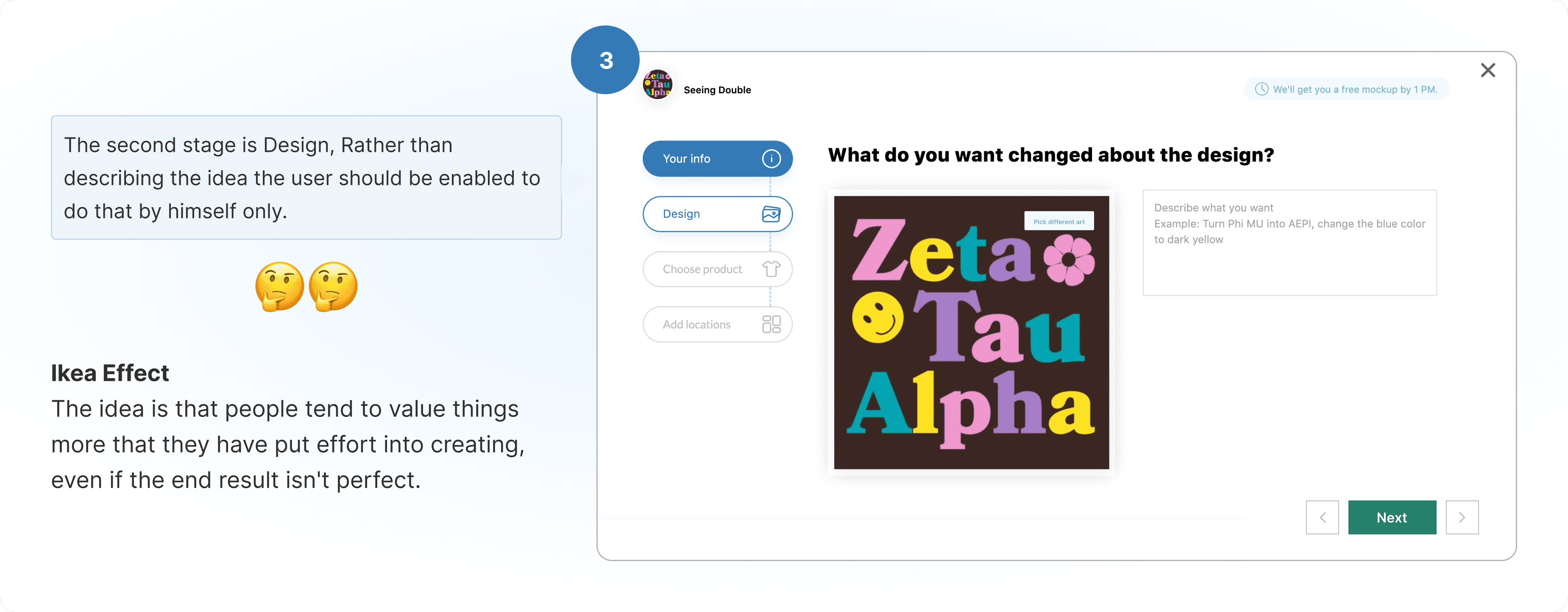
There were two designers on this, one will take over the Design tool( Which will enable the user to design something on the product by himself) and the other will take over the Self-checkout process. I was the one who was working on the self-checkout process.

The cart to checkout journey was in itself a complex problem as it was not a normal retail journey that we see on the e-commerce platforms. Here the concept of group order exists which affects pricing and minimum order quantity. You will get to know about it further ahead in the case study.

The Framework That Gave Clarity

To design a self-checkout system from scratch, I used the 5W and 1H framework (Who, What, When, Where, Why, and How) to deeply understand the problem and guide our design decisions. This framework helped us identify the key aspects of the user journey and ensure that the new system addressed the core pain points effectively.

What

Users want to place custom apparel orders efficiently, without relying on campus managers. They need to:

  • Save and review designs.

  • Add items to their cart.

  • Enter shipping and payment details.

  • Track the status of their orders.

Why

Dependence on Campus Managers: Users cannot independently modify designs or process payments, leading to delays.

  • Lack of Transparency: Users have no way to track the status of their orders or design approvals.

  • Complex Checkout Process: The existing process is cumbersome, with too many steps and unclear instructions.

Who

The primary users of the self-checkout system are student organization leaders and bulk order customers. These users are typically responsible for placing large orders for their organizations, teams, or events.

Where

We want to enable the user to use the checkout feature on website and on web-mobile.

When

Users face challenges throughout the ordering process, particularly:

  • During Design Approval: Waiting for campus managers to approve designs causes delays.

  • At Checkout: A lengthy and confusing checkout process leads to cart abandonment.

  • After Placing Orders: Lack of transparency about order status creates frustration.

How

We addressed the pain points by designing a self-checkout system that:

  • Empowers Users: Allows users to independently place orders, approve designs, and track order status.

  • Simplifies the Checkout Process: Reduces the number of steps and provides clear instructions at every stage.

  • Increases Transparency: Introduces real-time order tracking and status updates.

  • Optimizes for Mobile: Ensures the system is user-friendly on mobile devices, where many users access the platform.

50 Interviews,One Clear Pattern

Interviews: Conducting in-depth sessions with students, campus managers, and first-time buyers to understand their pain points.

Competitive Analysis: Studying e-commerce self-checkout flows from platforms like Custom Ink and Printful to identify industry best practices.

Usability Testing: Observing how users navigated through the checkout process to pinpoint usability issues and confusion points.

My Goal

As Designer, my goal was to design a frictionless and intuitive self-checkout system that would

Leverage Familiar Patterns: Design a flow that feels instantly usable by mirroring established behaviors from mainstream e-commerce platforms.

Improve Conversion: Streamline the cart-to-checkout journey by reducing unnecessary steps, clarifying pricing, and minimizing user hesitation.

Reduce Abandonment: Identify and eliminate friction points that typically lead to drop-off during checkout.

Support Business Growth: Replace manual bottlenecks with a faster, self-serve flow—leading to quicker order completion and improved retention.

The Cart Page That Changed How Students Order

These are the designs which we came up through after all the research, iterations and usability testings,

Check Out Screen

Add color and Product options

These are the designs which we came up through after all the research, iterations and usability testings, Below is the flow of adding a color option.

The color is into two parts, one is the logo/design color(art) which is on the left and the other is the product color which is on the right.

The user changes the product color and now you can see that the color of the art is not that much visible on the product.

The user selects the logo and changes the color of the design.

Success state of the color options.

The user is now adding new product

The user will again go through the same process of editing art/product color.

The user will again go through the same process of editing art/product color.

Checkout Page - One Page, Zero Confusion

The user will again go through the same process of editing art/product color.

Our platform is a bit different from the e-commerce out there. Normally after selecting size user adds quantity on the cart page and then he proceeds, but here the user will select sizes on the checkout page.

Why size selection on the checkout not on the cart?

It was seen in the usability testing that the user was trying to figure out the quantity and price behaviour.

Because of that the user was either taking time or was dropping off from moving to the checkout page.

So to prevent that we decided to just include total quantities on the cart page.

Shipping and payment method section

200 Sessions Revealed What the Design Was Missing

Upon seeing more than 200 sessions of the funnel which included a user adding product to cart and placing an order I identified a pattern. On the checkout page the user seemed to be clicking on the thumbnail of the product multiple times and just after that he used to pause the checkout journey and go to the design tool to check the product.

We identified that the user wants to see an enlarged image of the item before clicking on confirming the design to print. So based on that we created an iteration.

We solved the problem by giving a functionality where the user will hover over the thumbnail of the item, the image of the item will be visible in an enlarged view.

The Numbers That Made It Worth Building

As Designer, my goal was to design a frictionless and intuitive self-checkout system that would

1- Organisational Growth Achievement

The platform experienced dramatic expansion in student organization adoption, growing from 150 organizations to 341 active student organizations - representing an increase of 191 organizations (341% growth) within the 8-week implementation period (May-July 2025).

2- Users Metrics

Our self-checkout system achieved exceptional user engagement with 92% of registered student organizations actively utilizing both the live design tool and automated checkout features.

3- Revenue

The checkout feature processed 500 orders across 189 of the 247 active student organizations, generating $197,250 in total revenue with an average order value of $394.50, where 112 organizations (45%) completed repeat orders within 60 days, demonstrating strong platform adoption and customer retention.

What 50 Conversations Taught Me About Real UX

As a designer, this was my first venture into the B2C domain, and I absolutely embraced every challenge. The most rewarding aspect was conducting over 50 user interviews with student organization leaders and members. These conversations transformed my understanding of user needs and fundamentally changed my approach to user research, making it my favorite part of the design process.