Built a Habit Tracking App with AI

Exploring how AI fits into the modern product development workflow, from planning and implementation to UI refinement and deployment.
Case study

HabitMe

A photo-first habit tracker, designed and shipped solo with AI as a build partner

Role

Product Designer & Builder (solo)

Platform

iOS / Android (Expo, React Native)

Timeline

1 week, May 2026

Tools

Figma, Cursor, TestFlight

Overview

HabitMe is a simple habit-tracking app I built as an experiment to explore how AI tools can accelerate the product development process. The goal wasn't to solve a specific problem or create a feature-rich habit tracker—it was to understand how much of an app could be designed, built, tested, and shipped with the help of AI, and where my own judgment was still necessary.

The app is intentionally minimal: create a habit, capture one photo per day as proof, and track your progress over time.

This project was less about the product itself and more about learning how AI fits into the workflow of designing and shipping software.(If you want to see some stronger product thinking, and more complex technical execution, I'd recommend checking out Blindr.)

HabitMe is a simple habit-tracking app I built as an experiment to explore how AI tools can accelerate the product development process. The goal wasn't to solve a specific problem or create a feature-rich habit tracker—it was to understand how much of an app could be designed, built, tested, and shipped with the help of AI, and where my own judgment was still necessary.

The app is intentionally minimal: create a habit, capture one photo per day as proof, and track your progress over time.

This project was less about the product itself and more about learning how AI fits into the workflow of designing and shipping software.(If you want to see some stronger product thinking, and more complex technical execution, I'd recommend checking out Blindr.)

Understanding the ground before standing on it

Before opening Cursor or writing a single prompt, I spent time understanding the pieces I’d be directing rather than just naming them. I wasn’t going to write the code myself, but I needed to know enough to ask the right questions and judge the answers I’d get back:

What React Native and Expo actually are, and why most small apps now start with Expo rather than bare React Native

What Expo Go is for (fast iteration on a real device) versus what it can’t do (it’s not your actual shipped app — no custom icon, no splash screen, no App Store presence)

What TestFlight is, how it differs from a public App Store release, and that it requires an active Apple Developer account behind it

Understanding different AI models and choosing the right one for each task.

At a high level, what it actually takes to get an app from “code on a laptop” to “something installed on someone else’s phone” — build, sign, submit, review

This step mattered more than it sounds like it should. Every time something broke later, the fix usually depended on knowing which layer the problem belonged to — was this an app bug, a device-connection issue, or an Apple account issue? Without this groundwork, every error would have looked the same.

The design brief

Once I had the concepts straight, I moved to prompting the build. I didn’t open with a tech stack — I opened with the product, described as user-visible behavior, with reference screenshots attached for the empty state and the active-habit state:

PROMPT 1

Model used - Opus Extra 4.7

Create a Habit Tracking app using React Native. The following are the features and the use cases of the app

1- When there are no habits, the user sees a button to create a new habit.

2- The user types the name of the habit and confirms.

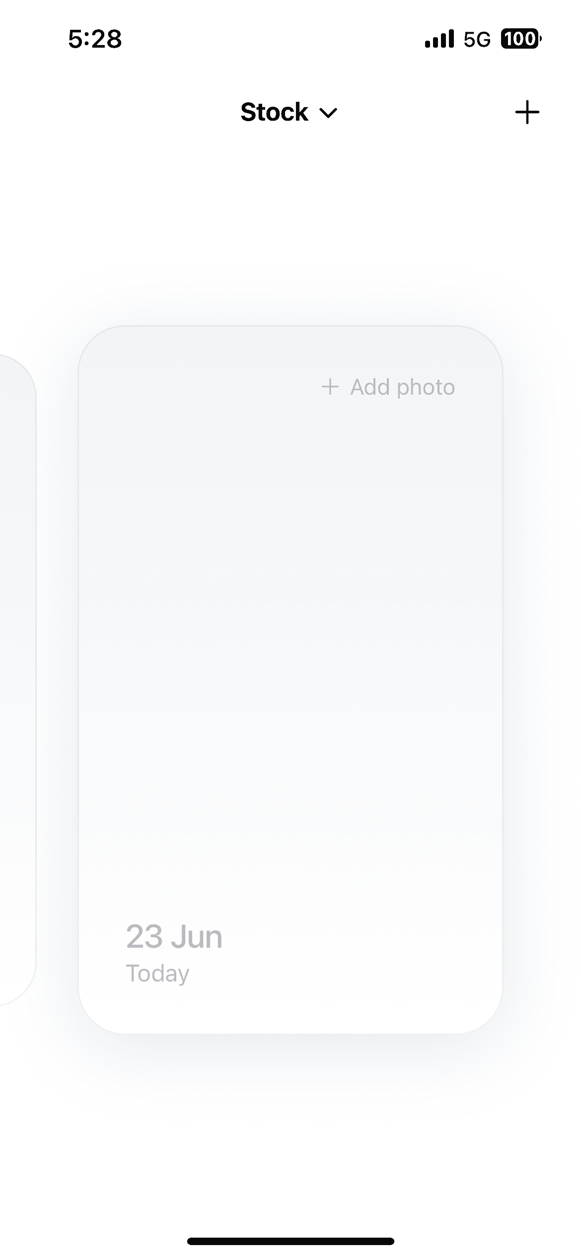
3- Once we have a habit created, we see cards that are tapable in the form of a carousel.The cards can be tapped on to open the gallery and upload an image to show that the habit is done.

4- They can add images of previous days if they have not added it.

5- They can also can also re-upload an image if they want to.

6- If there are more habits, the user can switch between them by tapping on the title on the top of the screen. A chevron will be there beside the title in case there are more than 2 habits.

I have attached the images for the empty states and the states where there are habits for your reference. Ask me any question if you need to before creating the plan.

Reference mockups attached to the opening prompt — empty state (left) and the habit card with carousel peek (right)

Reference mockups attached to the opening prompt empty state (left) and the habit card with carousel peek (right).

Once the first version was generated, I asked Cursor how to run it on a physical device. That led me to Expo Go, which allowed me to scan a QR code and instantly view the app on my phone. I wish I had the AI result saved with me so that I could have showed you the comparision, the output was 50% fine and it required tuning. The next section highlights some of the prompts I used during this refinement process and how they helped bridge the gap between a functional implementation and the final UI.

The UI pass — where most of the real back-and-forth happened

From this point, the refinement process became much more visual. While Cursor was able to recreate the overall layout and functionality, many of the design details existed only in Figma. To close that gap, I started pulling exact values- spacing, borders, shadows, and other visual specifications directly from the designs and feeding them back into the prompts.

Some of the Prompts:-

PROMPT 5

Model used - Auto

Thanks. Lets now polish the UI. Make the following changes to @HabitMe/src/components/DayCard.tsx

1- Add a border with 2 px with color #4048 with 2% opacity.

2- Add subtle shadow to the card.

3- The previous dates should come when I swipe right, currently the dates are coming when I am swiping left

PROMPT 6

Model used - Auto

1- The card also needs to have a gradient of #F0F4F7 and #FFFFFF from top to bottom.

2- The drop shadow value is as follows, #404048 at 12% opacity, 8px on the Y axis and 24px blur.

PROMPT 9

Model used - Auto

The current carousel animation is not smooth, when we swipe left the card gets big in an unsmooth manner, can you improve the animation. During the animation, the shadow of the card appears later, so can you fix that too? After analyzing the animation when swiping left, the cards come at the center, then there is a very minor delay, after that it gets scaled up. The delay should not be there. Every thing should be smooth, no instant animation effects should be there.

PROMPT 12

Model used - Opus 4.7 High

The current carousel animation is not smooth, when we swipe left the card gets big in an unsmooth manner, can you improve the animation. During the animation, the shadow of the card appears later, so can you fix that too? After analyzing the animation when swiping left, the cards come at the center, then there is a very minor delay, after that it gets scaled up. The delay should not be there. Every thing should be smooth, no instant animation effects should be there.

Through multiple rounds of refinement, the card evolved to include the correct gradient, shadow treatment, border styling, proportions, and carousel behavior. These improvements did not come from a single prompt. They came from repeatedly reviewing the UI on a real device, comparing it against the design, and providing increasingly specific instructions until the implementation matched the intended experience.

5. The build → test → fix loop

Once the UI matched intent, I went back to testing the app the way a real person would use it, and that’s where functionality bugs started surfacing — the kind that don’t show up just by looking at a screen.

The clearest example:

ISSUE -

Pop-up Missing

PROMPT 42

Model used - Auto

1. When I tap on the card that has already an image, I want you to create a popup to show either to replace the photo or just cancel.

2. When the user replaces photo the new photo shall be updated.

ISSUE -

After replacing a photo on a habit card, the new image wouldn’t show up

PROMPT 44

Model used - Auto

When I am selecting the new image, the new image is not reflected in the card. Can you please fix that?

This loop run it, find what breaks under real use, fix the actual cause, run it again** — repeated until the app held up under normal use, not just under a clean first pass.

Getting it in front of someone else: TestFlight

With the product and UI largely complete, the final challenge was distribution. Getting the app onto real devices introduced a different set of problems related to builds, provisioning, and TestFlight setup. Unlike design and development, these issues were less about writing code and more about navigating platform requirements and deployment workflows.

After a few rounds of troubleshooting and iteration, the build was successfully distributed through TestFlight, allowing the app to be tested on physical devices. With that milestone reached, the project had gone from a Figma mockup and a series of AI prompts to a working mobile application that could be installed and used by others.

What shipped

Empty state to first habit flow, with no onboarding friction

A 7 day photo carousel with paging interaction and a refined scroll-driven animation

Photo capture, replace with confirmation.

Multi-habit support with a switcher that only appears once it’s actually needed

Fully local persistence no account, no backend, no data leaving the device

A working iOS build distributed through TestFlight.

The goal was never to build a feature rich habit tracker. The app was intentionally constrained so that I could focus on understanding how AI could assist with planning, implementation, UI refinement, testing, and shipping. By the end of the project, the app was functional, stable, and distributed through TestFlight, which was enough to answer the question that started the experiment.

What this project actually taught me

1

**Understanding the fundamentals before prompting changed everything downstream.** Knowing what Expo Go, EAS, and TestFlight actually are meant I could tell, mid-debug, whether a problem was a code issue, a device-connection issue, or an Apple account issue.

2

**Simulator-done and device-done are two different milestones.** The FlatList crash and the connection timeouts never showed up until I tested on my actual phone.

3

**Visual polish takes the most rounds, not the fewest.** The UI pass on a single card component took more back-and-forth than any other part of the build, because “smooth” and “centered” only mean something once you can see them — and the first attempt rarely got there.

4

**The build-test-fix loop surfaces real bugs that visual review never will.** The image-cache bug only showed up through actual use, not by looking at the screen.

5

**Some problems stop being technical, and that’s exactly where a designer’s judgment matters most.** The Apple account issue was never going to be solved with another config change — recognizing that and re-platforming the app was a decision, not a debug.

6

**Shipping is its own phase, not a footnote.** It took longer than designing and building the app combined, and deserves to be planned for as such.